Jump to Forum..
- Boddunan.com Updates
- - Announcements
- - Contests & Rewards
- - Group Discussions
- Discussions
- - General Discussions
- - Improving English Writing Skills
- - Q n A - Find answers to your questions
- - Daily Dose
- - Topics of Interest
- - - Current Affairs & Latest News
- - - Education & Learning
- - - Humor & Jokes
- - - Movies & Entertainment
- Your Vote Counts
- - Feedback
- - Suggestion Box
- Shoutbox
- - Introduce Yourself
- - The Lounge
- - Help
- - Testimonials
Like it on Facebook, Tweet it or share this topic on other bookmarking websites.


15 years ago
Hi,
I am herewith posting my new logo.
the logo description are as follows
1.The blue color has been chosen keeping Knowledge = Wisdom in mind
2.The dotted arrow symbolizes growth & transperincy (means Pure knowledge)
3.Illustration of Human faces with color variation symbolizes the difference in knowledge level.
4.The text is kept simple keeping the marketing part in mind i.e. it should be simple to Convey.
The overall thaught behind the whole design was that the logo should be driven by punchline yet the name should be prominent.
thanks & regards
Ruchika
P.S. (Looking forward from all of u for a feedback)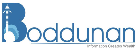
When I was writing the reply to Vijay's logo, this post was not there. And when I came back, I saw another wonderful design with the very good concept. And the actual contest is began. Now three logos with two wonderful concepts. Simply amazing.


15 years ago
Vijay wrote:
[quote]Its my next design.The pen denotes to write more and more. [/quote]
You are rocking Vijay. The idea of using pen and write more concept is amazing.
One small suggestion. The font used for the text is a normal font which is available to anyone. You can apply some effects/design to it so that it will be unique.
[quote]Its my next design.The pen denotes to write more and more.
[/quote]You are rocking Vijay. The idea of using pen and write more concept is amazing.
One small suggestion. The font used for the text is a normal font which is available to anyone. You can apply some effects/design to it so that it will be unique.
When opportunity is in front of you, don't hesitate to catch it. It will never come to you again. - Maverick
15 years ago
Ruchika wrote:
[quote]Hi,
I am herewith posting my new logo.
the logo description are as follows
1.The blue color has been chosen keeping Knowledge = Wisdom in mind
2.The dotted arrow symbolizes growth & transperincy (means Pure knowledge)
3.Illustration of Human faces with color variation symbolizes the difference in knowledge level.
4.The text is kept simple keeping the marketing part in mind i.e. it should be simple to Convey.
The overall thaught behind the whole design was that the logo should be driven by punchline yet the name should be prominent.
thanks & regards
Ruchika
P.S. (Looking forward from all of u for a feedback)
When I was writing the reply to Vijay's logo, this post was not there. And when I came back, I saw another wonderful design with the very good concept. And the actual contest is began. Now three logos with two wonderful concepts. Simply amazing.[/quote]
When I was writing reply to the Vijay's logo, this logo was not posted already. When I came back I saw another wonderful concept. Looking like the competition getting tough day by day.
Three logos with two amazing concepts.. Simply superb.
And one small suggestion again. The logo width should not cross 200 pixels as described in the rules. And the original file should be sent to Support team in order to be eligible, means the logo should be re sizable/editable and can be used in anywhere.
When opportunity is in front of you, don't hesitate to catch it. It will never come to you again. - Maverick

15 years ago
This is really great contest. Time to be creative. Will catch up with you all with my idea of the design ;)
till then cya..!!
till then cya..!!
15 years ago
Very beautiful logo Ruchika
well done
well done
15 years ago
Its a really nice opportunity.
Thanx for sharing this
Thanx for sharing this
15 years ago
Hi,
Here Comes My second Version of Logo....
with Same Blue Theme
2. B formed with a element depicting upward arrow & Circles over laping expressing the target.
3.Eyes depicting - reading with a microscopic eye.
I am posting a 2 x size coz visibility will be less for review. :(
So Finally I will be left with one more last chance to come up with new Idea....
I request all the Viewers to give me ur inputs on color, elements & what all u feel can enhance the logo of the Great site www.boddunan.com.
Thanks & regards
Ruchika

15 years ago
Hello Friends,
There are excellent entries of logo designs. I look frward for many more designs from other members.
:ohmy:
- Harish Jharia
There are excellent entries of logo designs. I look frward for many more designs from other members.
:ohmy:
- Harish Jharia
Harish Jharia
http://harishjhariasblog.blogspot.com/
15 years ago
what is the meaning of the word boddunan
Page 3 of 12
You do not have permissions to reply to this topic.
Related Topics